This story highlights my journey of designing Rhodamorgenstern's “Diverse” EP album packaging, balancing creative vision with practical constraints, and using graphic design to enhance our band's identity and reach.
The lack of reach
When our album recording was nearly complete, we realized we needed more exposure to people who supported homegrown music. Playing live shows at small bars in our hometown wasn't enough.
Visuals that resonate like music
We decided to make an album packaging design with a strong brand identity that reflected our band’s character and the messages in our songs.
My Role
I was responsible for the creative direction of the entire design process for this project. As the band leader, I also handled PR and online marketing, which involved a lot of graphic design work for gig posters and other promotional materials on social media.
The main design tools I used were:
Adobe Illustrator - for the logo design and album art vector graphics.
Adobe Photoshop - for the layout design of the inner side of the album packaging.
The EP album was released in 2012.
The band as ambitious creatives
Back in my college years, I formed an alternative punk band called Rhodamorgenstern. The local music scene in our small city in Cebu, Philippines, was buzzing, and underground music thrived in colleges and universities. Local bars were packed with students eager to enjoy weekend night shows featuring live bands. Our band played cover songs from our inspirations like Paramore, No Doubt, and Dashboard Confessional, but most of our sing lists consisted of our original compositions—a common practice among local bands then and now. We loved writing and recording our own songs using affordable equipment and free digital audio workstation software. After numerous recordings, weekend gigs, and promoting our songs on MySpace, we decided it was time to put out a more polished music album.
With the album nearly complete, the next step was designing the album packaging. Budget constraints were a significant challenge since some of our bandmates were still in college, and others had just started their first jobs. We needed to carefully manage our expenses, from recording session bills to transportation and food costs.
As the band leader, I handled PR and online marketing (what we naively called 'band promotion' back then), which involved creating a lot of graphic design materials for gig posters and social media promotions. To save money on the album project, I leveraged my graphic design skills to develop the EP album packaging design.
Design process & details
The concept development for the album cover started with some quick sketches featuring a screaming woman’s face, inspired by one of our songs, "A Thousand Years of Pain," which tells the story of a young girl abandoned by her father. The initial sketches evolved through several iterations until we settled on a final design.
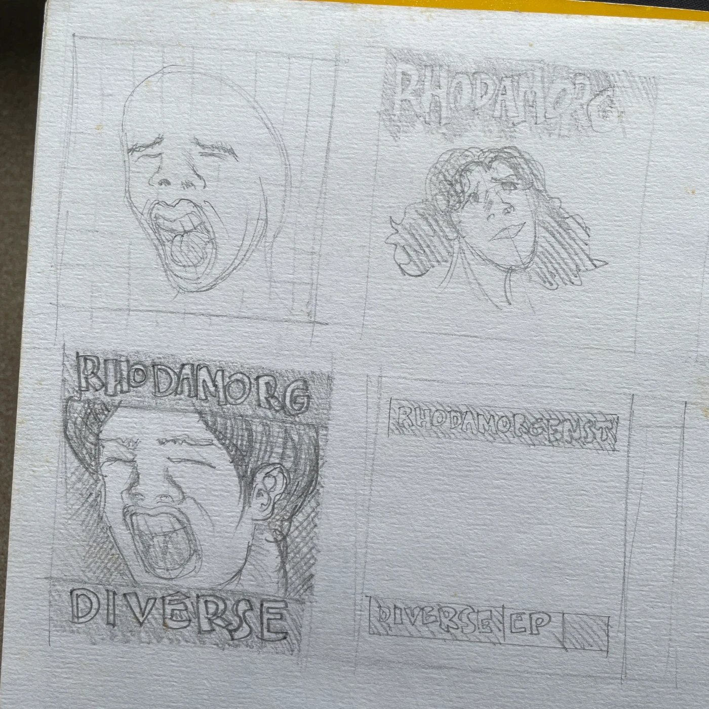
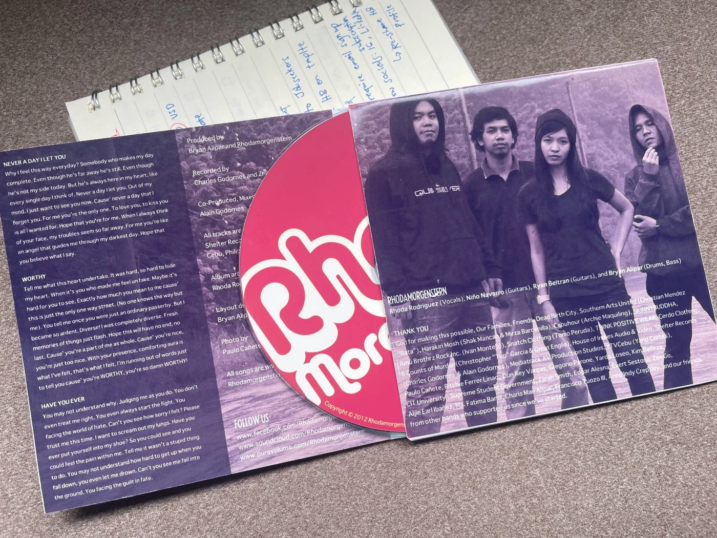
The album packaging is a 2-page insert type booklet. The front cover showcased the main visual concept, while inside the booklet was in grayscale with a photographic theme.
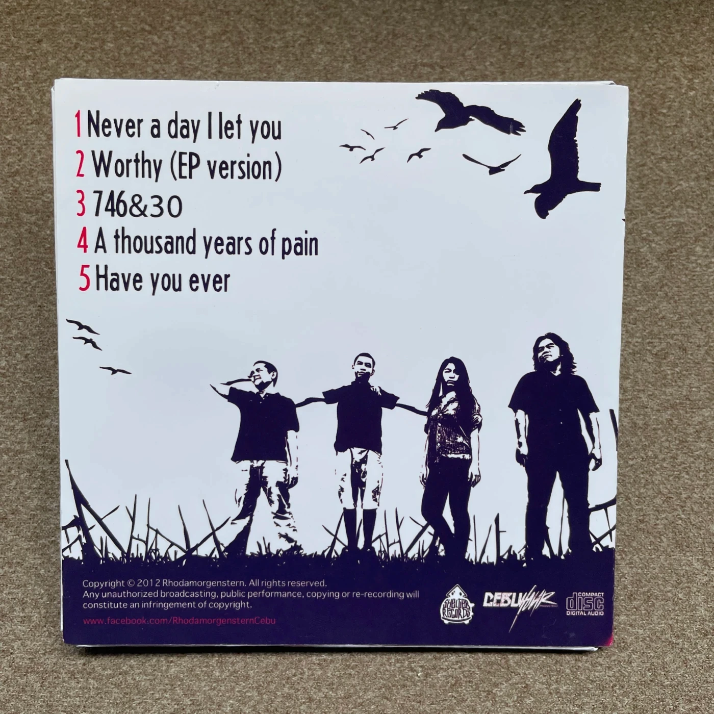
For the front and back cover, inspired by the emo and gothic scenes, I created an image of a dead tree in a garden with crows flying in the sky. The back cover extended this graphic, listing the five tracks on the record and a vectorized photo of our band standing in the garden next to the dead tree.

For the inner panels, we needed photographic images, so a college friend who was into photography helped arrange a band photoshoot in the scenic highlands of Cebu. The grayscale color scheme complemented the photos and connected with the monochromatic album cover design. This section included lyrics from some songs, a short band biography, band member names, and thank you messages to our friends, production crew, and supporters.
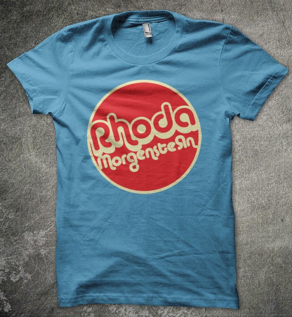
Band logo & merch
In 2010, CDs were still a popular medium for music, despite the rise of portable music players. Bands commonly released their records on CDs with visually appealing packaging. Our band logo, that I had developed before the album design, was round, making it perfect for printing on the CD. Positioning the logo correctly around the CD’s center hole was a bit challenging, but after a few tweaks, it fit perfectly, with the "o" in "Rhoda" aligned with the hole.

To complement our marketing materials, we also produced band merchandise, such as t-shirts, to include in a package deal with the CD for our supporters.
Takeaways
Designing the album packaging was a truly enjoyable experience. I picked up new techniques and learned to use design tools more efficiently, making my work process smoother. I also discovered strategic ways to communicate with our target audience through visual cues. Collaborating with my bandmates on this project was incredibly beneficial, as it amplified our creativity. It's always easier to work on a project you're passionate about, and in this case, it was creating an album cover that represented the songs we wrote. This experience has inspired me to design more album covers for other artists in the future, to both sharpen my visual design skills and help them convey the message of their music through visual art.
Listen to Rhodamorgenstern's “Diverse” EP album.
Share this story
About the Author

Bryan Alipar
Founder, Creative Director at Hatchbloc
Passionate about business, design, and digital marketing. With a keen eye for detail and boundless creativity, Bryan offers a unique perspective on the fusion of aesthetics and strategy in the corporate landscape. When not dissecting business trends, he explores nature, fueled by his love for travel, music production, and coffee.