I lead a UX research project focusing on usability study for a client’s company policy management tool. Backed by two talented designers, our dedicated team provides design recommendations to stakeholders that could improve the web application.
My Role
I am the research lead for this usability study initiative, overseeing the coordination and execution of the project. I am fortunate to have the support of two talented designers who are actively contributing to the success of this endeavor. Together, we form a dedicated team working towards accomplishing our goals, which led us providing design recommendations to stakeholders that could improve the web application project that we had worked on for future releases.
Time frame:
Nov. 2024 - Jan. 2025
Problem
User complaints from past User Acceptance Tests (UAT) highlighted the need for a thorough evaluation of the user experience.
Solution
"Conduct a comprehensive usability test to identify problem areas and gather insights from users. To provide stakeholders with valuable insights into the usability test conducted by the UX team."
Process and Outcomes
When the client project began, I was the sole designer on the team. My design process at the time followed a fairly conventional approach: gather requirements, translate them into design mockups using my design tool, and then submit them to my leads for review and approval. Once approved, the mockups were handed off to engineers for implementation and proceeded directly to User Acceptance Testing (UAT).
However, this linear workflow often led to recurring issues reported during UAT—ranging from system errors and business logic flaws to usability concerns. With the project's tight timeline, addressing all these issues proved difficult. As months passed, unresolved problems accumulated, resulting in a growing backlog and missed opportunities to improve the user experience.
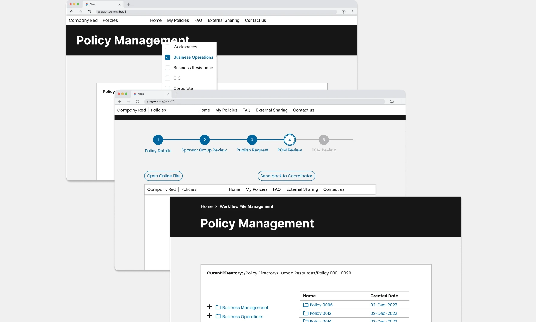
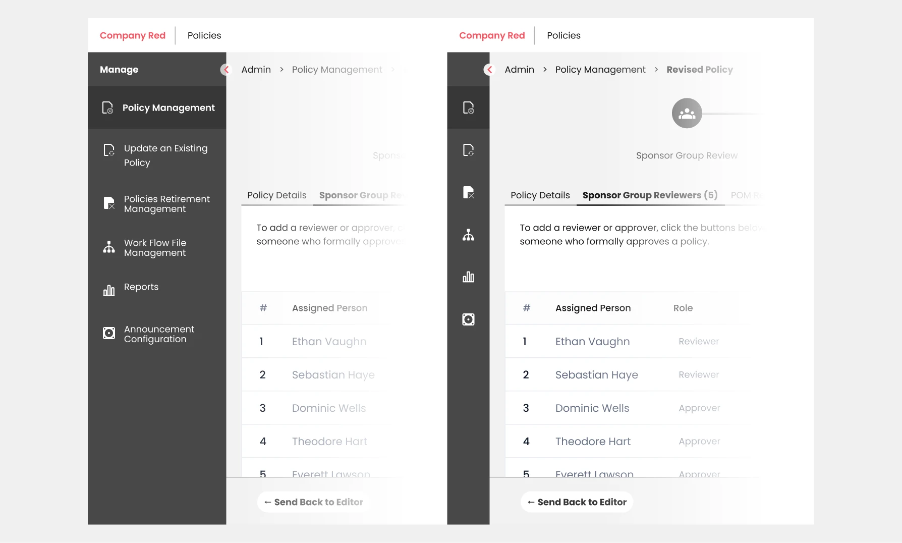
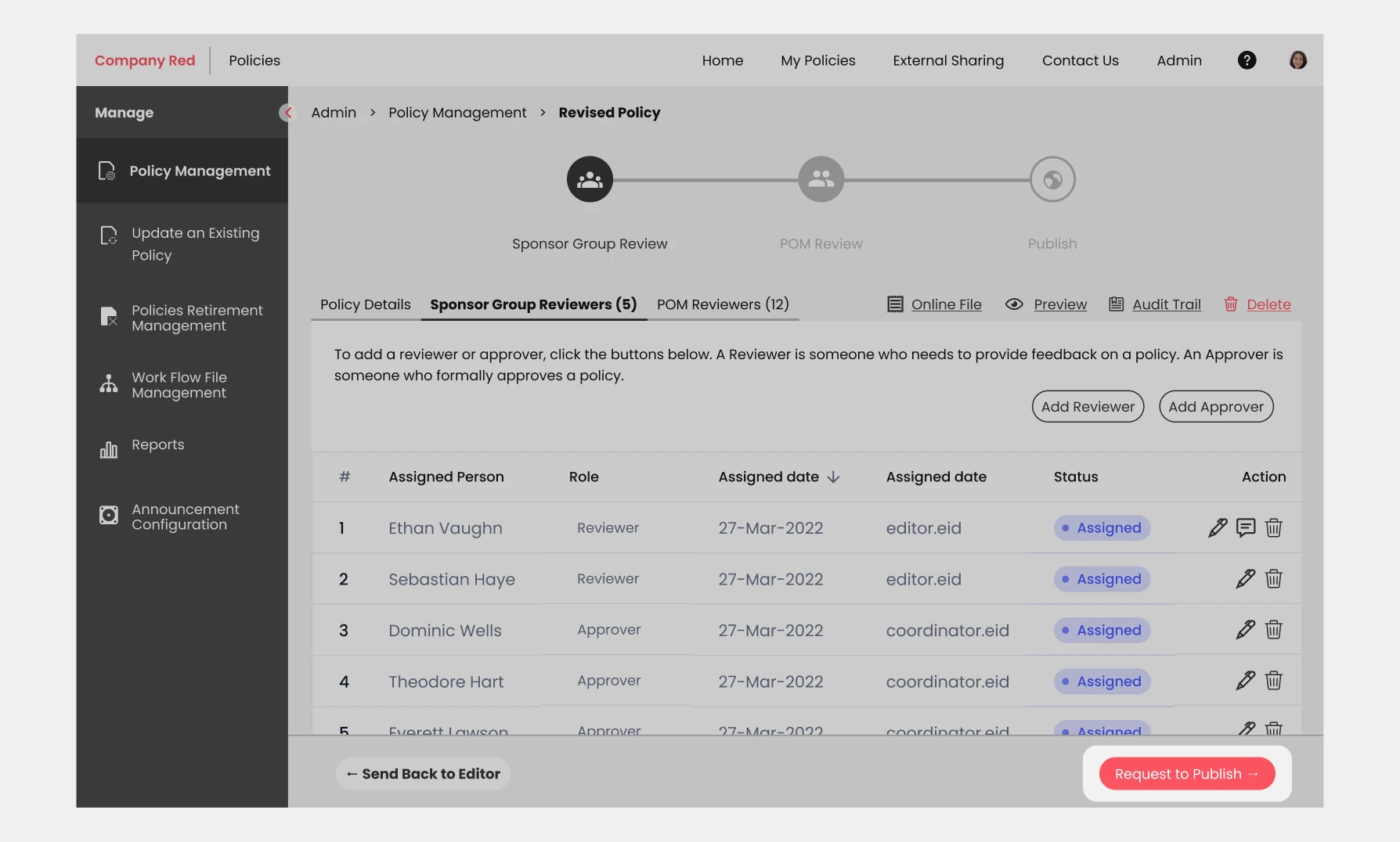
(Old Design)
Recognizing the need for a better approach, I initiated a plan to conduct a usability study—taking it on as a side project to proactively address the persistent issues. I was fortunate to gain the support of my two talented designer friends who eagerly joined the effort, and together, we were able to kick off the initiative without delay.
To ensure that the usability testing reflected the needs and behaviors of real users, participants were carefully selected from the product team, focusing on individuals who closely represented the target user group. The tests were conducted remotely via Microsoft Teams, providing a convenient and accessible platform for virtual collaboration.
Participants were asked to complete nine specific scenarios, each designed to evaluate the usability of the tool's configuration section—particularly the policy management pages, which are accessible exclusively to admin users. These tasks aimed to uncover any friction points within this critical area of the user interface.
To support thorough data analysis, all sessions were recorded using a screen recording tool, allowing the team to capture both user interactions and feedback with precision.
The usability tests yielded a wealth of insights, revealing key problem areas and usability challenges encountered by participants. Following the sessions, the UX team conducted an in-depth analysis of the findings and translated them into actionable redesign recommendations to enhance the overall user experience.
Redesign Recommendations
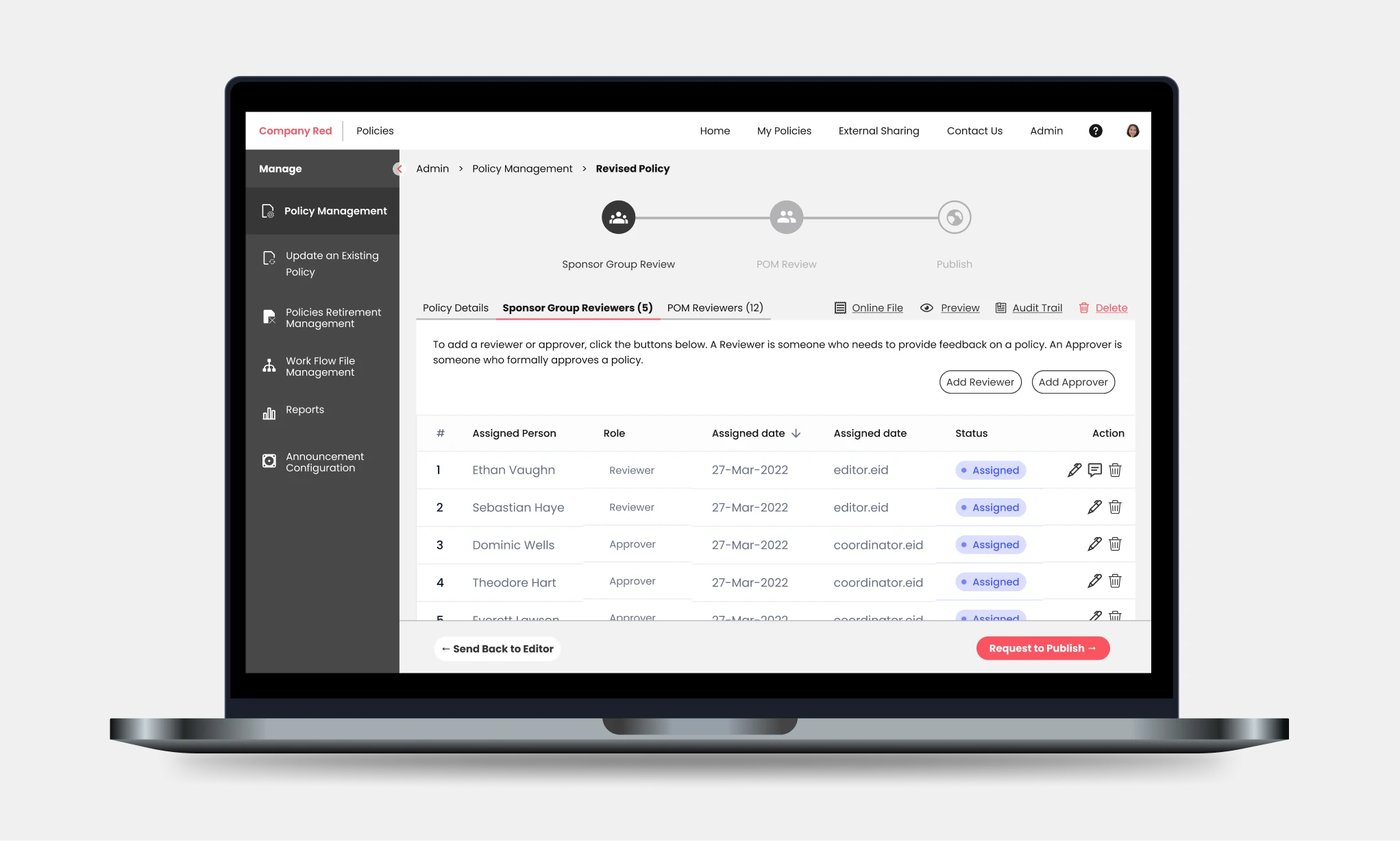
More accessible navigation
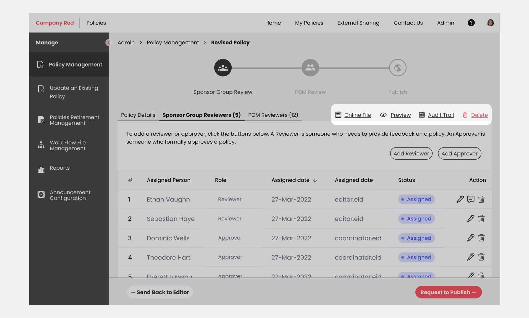
We have relocated the configuration menu to the left pane (sidebar) of the page, making it more convenient for users to access the main admin features. Additionally, we have made the navigation bar collapsible, allowing for a wider space in the main layout. To enhance visibility, we have also applied a purple shade to this component.
Progress Trackers, from 5 down to 3 steps
We conducted an experiment to optimize the progress trackers in the policy workflow. Initially, the process consisted of five steps, which felt overwhelming. Our goal was to streamline the process and reduce the number of steps to three. However, instead of completely removing the two steps, we redistributed them and embedded them into the main steps. To enhance clarity, we have replaced the numbers with icons on the steps. This change makes it more explicit and visually appealing for users to navigate through the process. This allowed us to prioritize the most important stages, such as the reviewing stages and the publish stage, in the policy creation process.

Workflow options
To address pain points identified during user testing, we have implemented a solution to make the main workflow options always accessible. Now, regardless of scrolling, these options will remain visible and clickable for users. By ensuring that these buttons stick to the page along with the trackers above, we have improved the overall user experience.
Workflow action buttons
Same with the workflow options, we also made the workflow action buttons always accessible, so we stick them on the bottom of the page regardless of scrolling. This way it could help the policy creation process faster.
Fluid Layout
To optimize the space on the page, we have made the decision to remove the top banner. This change allows us to utilize the available space more effectively, especially since most of the pages heavily rely on tabular data components. Additionally, when the left pane menu is collapsed, the table will stretch accordingly. This means that the more browser view or screen space available, the more data will be visible to the user.
Takeaways
Usability testing should be integrated early and regularly into the design process—even during the conceptual or wireframe stages. To gain stakeholder buy-in for such initiatives, it's essential to clearly communicate the problem you're addressing and how the proposed solution, like a usability study, will provide user-driven insights to validate assumptions and guide improvements.
Share this story
About the Author

Bryan Alipar
Founder, Creative Director at Hatchbloc
Passionate about business, design, and digital marketing. With a keen eye for detail and boundless creativity, Bryan offers a unique perspective on the fusion of aesthetics and strategy in the corporate landscape. When not dissecting business trends, he explores nature, fueled by his love for travel, music production, and coffee.